A bar chart shows the development of a subject, comparison of magnitudes among categories. It can also represent the proportion of elements in a bigger subject. Let’s plot a bar graph with Pandas in Python
Assume that you have a data.csv file that lists the price history of an item from 1990 to 2020 as follows:
The following code will get data from that file and save it to a dataframe.
Now, you can pot a bar graph for the price of the item. Different from plotting a line graph, you need to define the kind of the graph by kind='bar'.
Output:
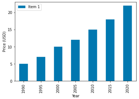
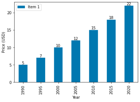
From the above graph, you can conclude that the price of the item increases dramatically from 1990 to 2020. However, this graph doesn’t show the explicit values in every year. If you want the reader to know these values, you can use ax.bar_label().
Output: