A bar chart shows the development of a subject, comparison of magnitudes among categories. It can also represent the proportion of elements in a bigger subject.
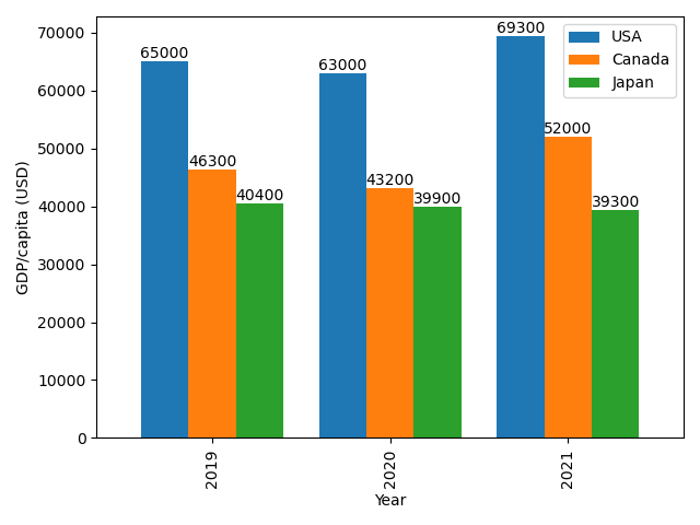
There can be a case that you need to compare multiple subjects in different timestamps like the GDP/capita of countries in the last recent years. Then, it’s time to use the grouped bar chart for data visualization.
Let’s plot a bar graph with Pandas and Matplotlib.
Assume that you have a file called gdp_capita.csv file that lists the GPD per capita of 3 countries: USA, Canada, and Japan from 2019 to 2021 as follows:
The following code will get data from that file and save it to a dataframe.
Now, you can pot a grouped bar chart that helps you compare the GPD per capita of these countries in each year and also see the trends of them.
Output:
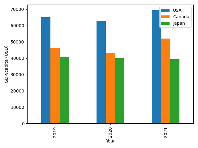
Look good, right? However, this graph doesn’t show the explicit values in every year. If you want the reader to know these values, you can use ax.bar_label().
Output: