Pandas is a great library for data visualization. Here you’ll see how to plot a line graph in Python with Pandas with some examples.
1. Simple example
Assume that we have a csv file, namely data.csv as follows:
First, let’s import pandas and get input data.
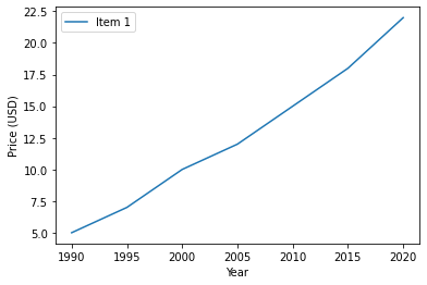
Now, we can plot a line graph for the price of a product varying from 1995 to 2020 in the data.csv file.
Now, you get a line graph as follows
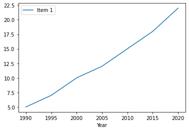
You can see that the above graph doesn’t have a title for y-axis. In case that you need to show the title for y-axis, you can add some lines like this
Then, you have the following graph
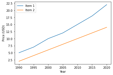
2. Multiple-line graph
How about plotting multiple lines in a graph? Imagine you have data_multiple_line.csv file like this
And you can plot multiple-line graph as follows
Output: